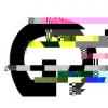
mdhdev Posted April 6, 2016 Share Posted April 6, 2016 I am creating an app that has a lot of text elements, buttons etc. I have set the initial size of the canvas to 1024 / 768 but I would like the app to scale up and fill all of the available space. When scaling the canvas up, the text elements become very Blurry (See image below): Is there anything that can be done about this or is canvas simply not well suited for this purpose? I'm thinking it may have been better to overlay some dom elements as most of the text heavy stuff is in a bar that runs across the top of the app. Link to comment Share on other sites More sharing options...
stupot Posted April 6, 2016 Share Posted April 6, 2016 Probably this is normal, if you scale any graphic up it will get a little blurrier, but there are different ways of scaling. Scaling text above x1.5 starts to bother me. Of course as you say, you could have your text in an html overlay, the browser will scale and re-render it when needed, it'll be crisp and high quality and faster, but it can make the underlying graphics look even worse as they will seem noticable blurrier than the text. If your app is UI intensive then it makes sense to move it to the DOM, if it's mostly in a bar then it sounds like it's nicely separated and wouldn't need to overlap the canvas which will cause less problems. Sounds like the winning way forward. If you think it's looking too blurry without any scaling, then check your positioning is not drawing at fractional pixel coordinates - this might not be apparent if the text object is centered, ie drawing an odd sized width graphic and centrered will result in a non integer final x coord, there's a round pixel flag for that. There are some things you could try if you stick to doing it in the canvas though - you could resize your canvas to match the viewport, you'll also have to manage the resizing and positioning of all your elements which will be a pain. You would probably choose a resolution for your images to be somewhere midway between the highest and lowest resolution you're expecting. - you could just maintain a number of sets of graphics and coordinates to cover various sized viewports, eg a hires, midres and lowres set, then maybe switch between them as the viewport crossed certain resolution thresholds. This is common practice for handling desktop/tablet/phone devices and works well naturaly as the desktop gets the hires stuff (which is probably on the fastest and cheapest connection) with the mobile devices getting a smaller asset sets (on slower more costly connections) and probably won't change viewport much. Of course it's all extra work! WombatTurkey and mdhdev 2 Link to comment Share on other sites More sharing options...
Tom Atom Posted April 6, 2016 Share Posted April 6, 2016 Hi, your game is rendered to some window with X * Y dimension (1024 x 768). If you then scale it up to larger window then pixels are interpolated to fill that larger window. In case you were scaling into 2048 * 1536, then every pixel would be 2x2 and it would look sharp. But this happens only seldom. Usually your scale ratio is not whole number and then it gets blurred... Just looking @stupot posted answer ... Anyway: you can play with "smoothed" - see this example http://phaser.io/examples/v2/display/render-crisp But I think it will work only in game window before it is stretched to fill some larger area. Best solution in my opinion: if your app is non-game app then build some kind of layout manager. After window resize reset game size to new window size (so it is always 1:1 without stretching) and refresh your layout manager to reposition controls. mdhdev 1 Link to comment Share on other sites More sharing options...


Recommended Posts